Best of African Talent

Ux UI Design
Project Overview
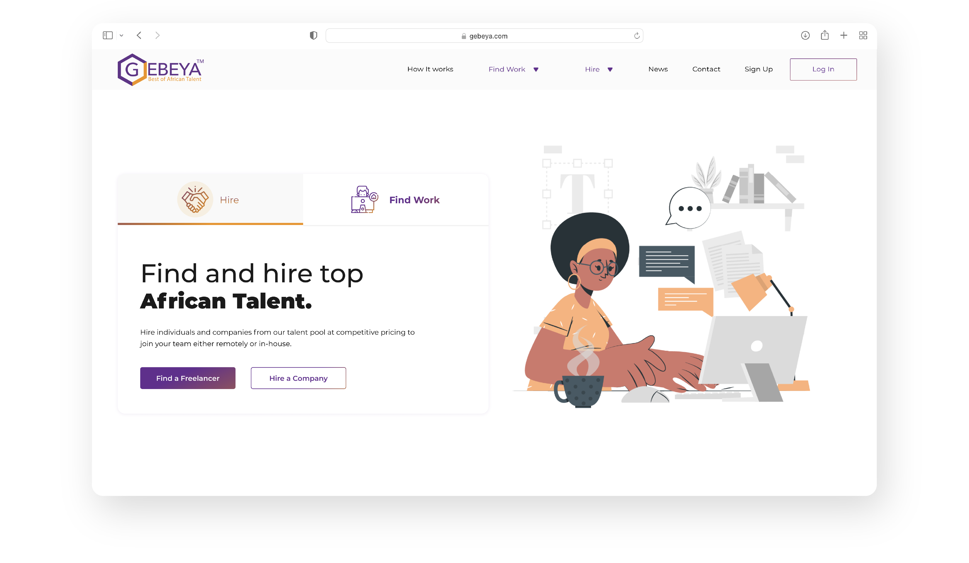
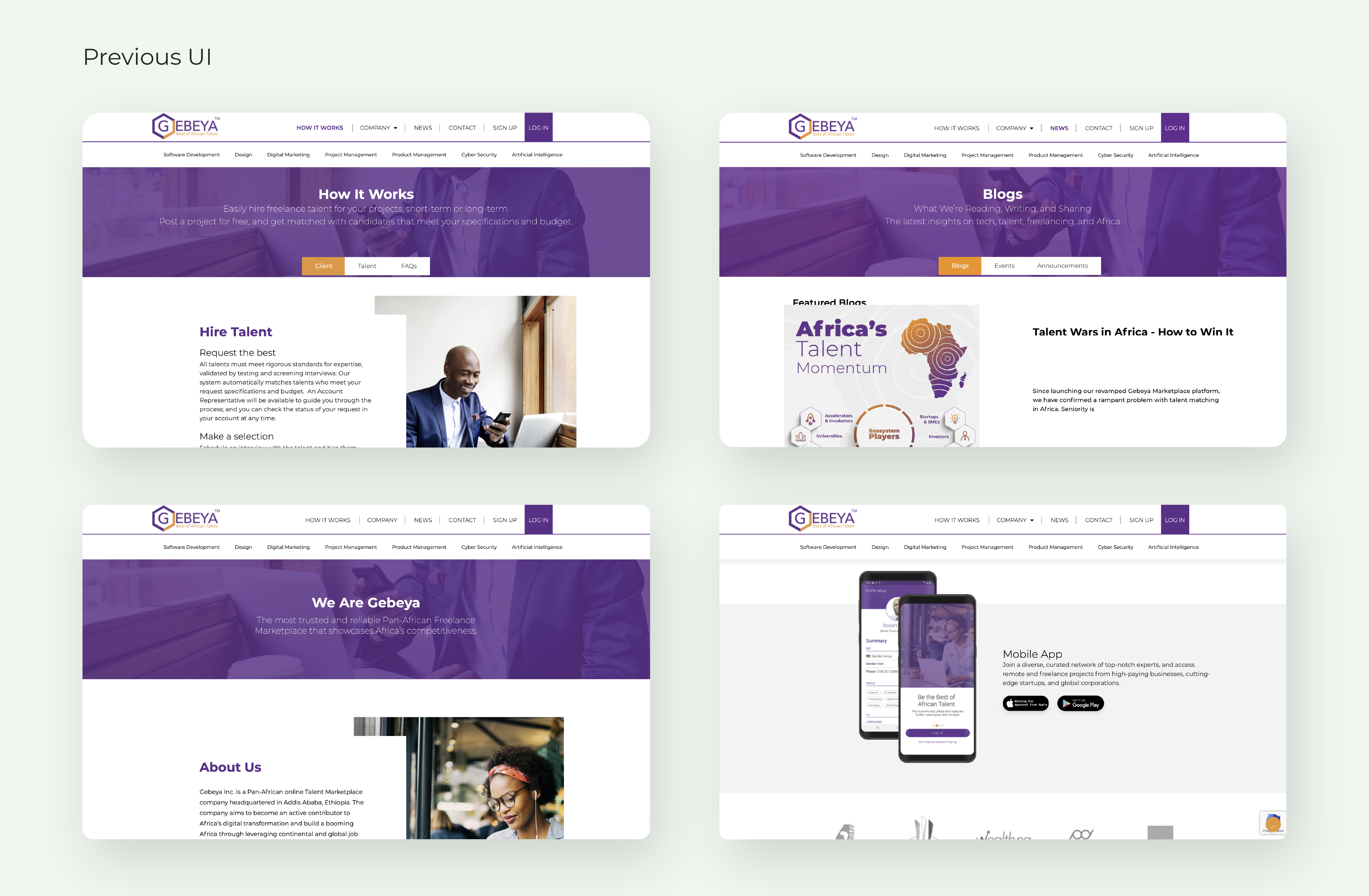
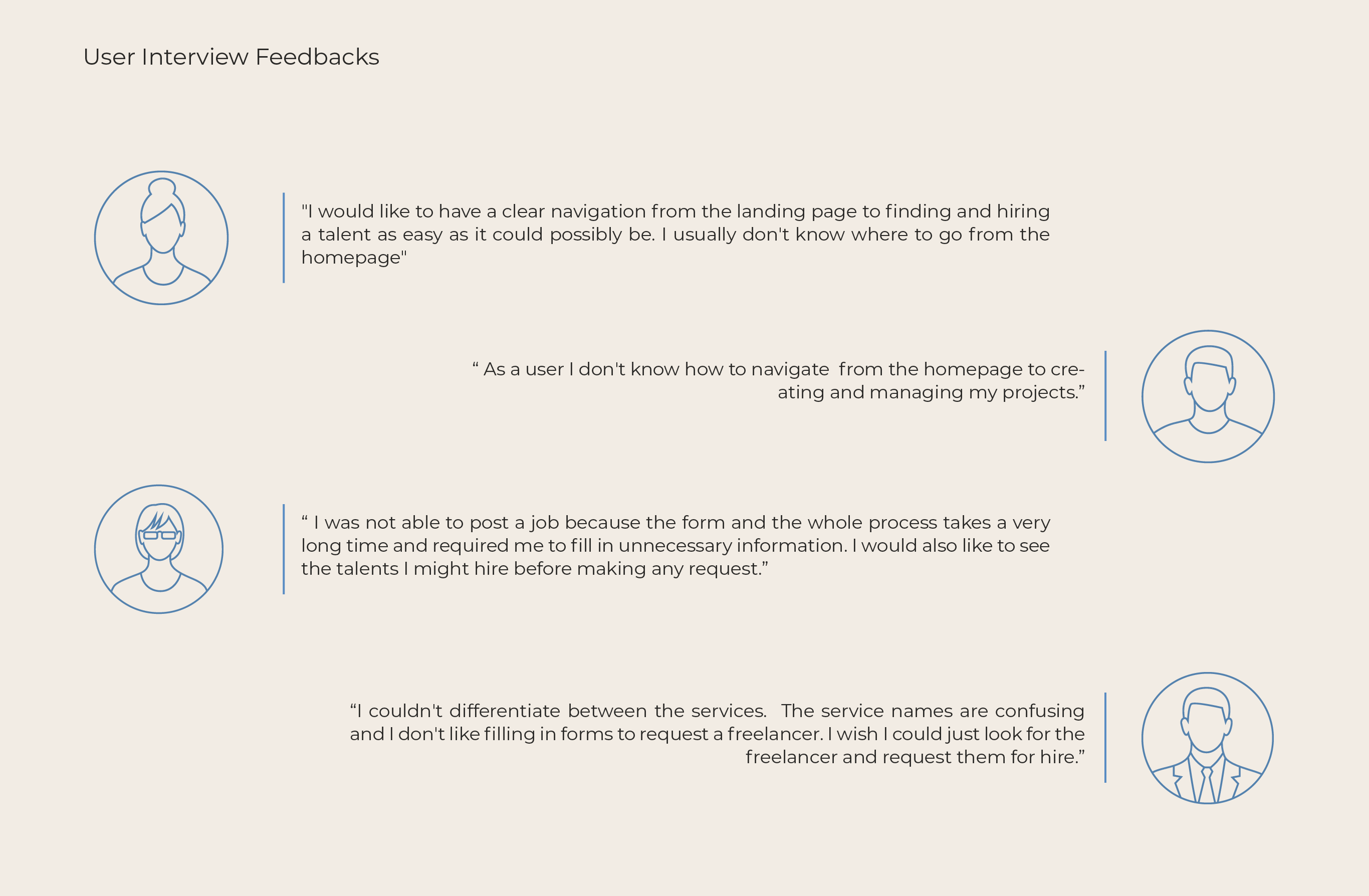
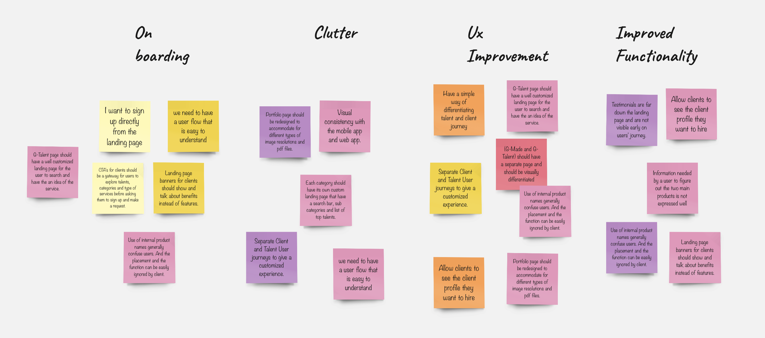
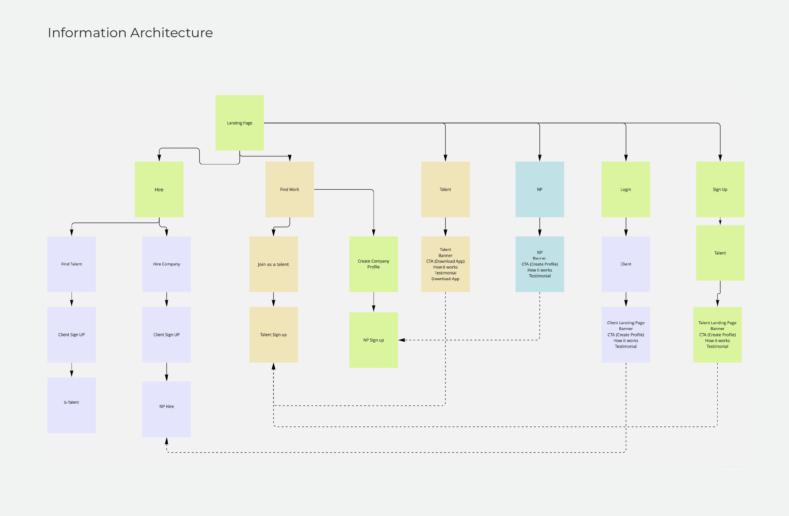
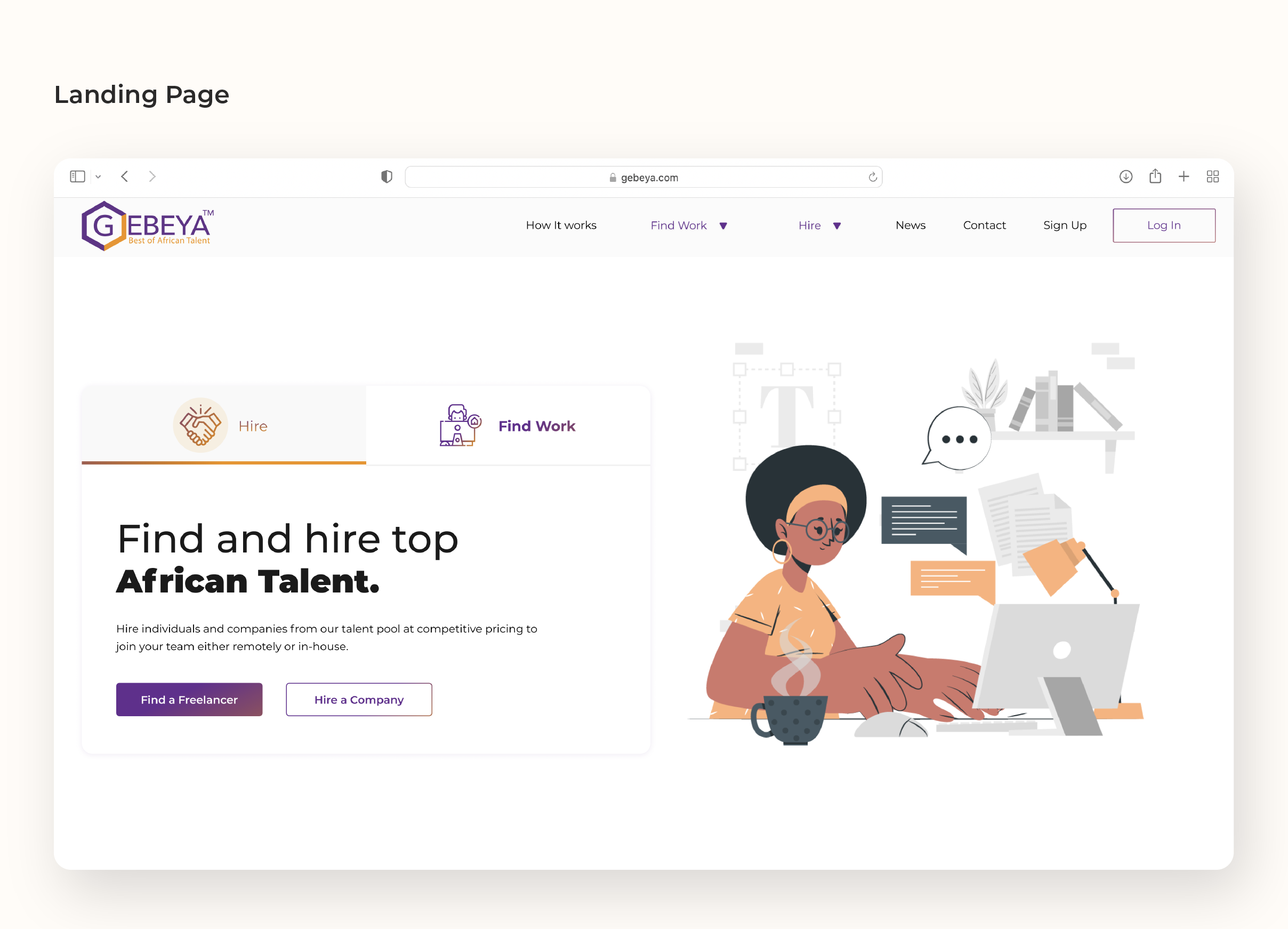
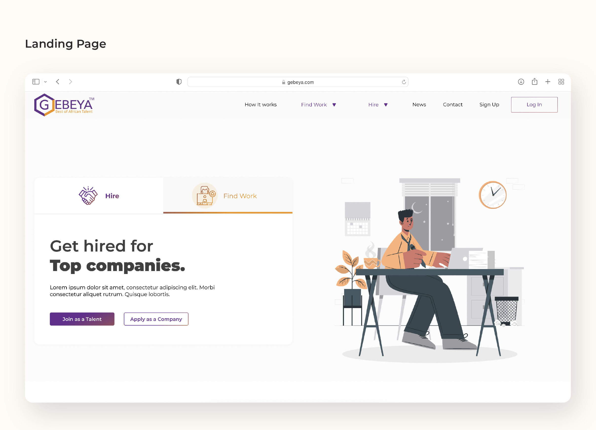
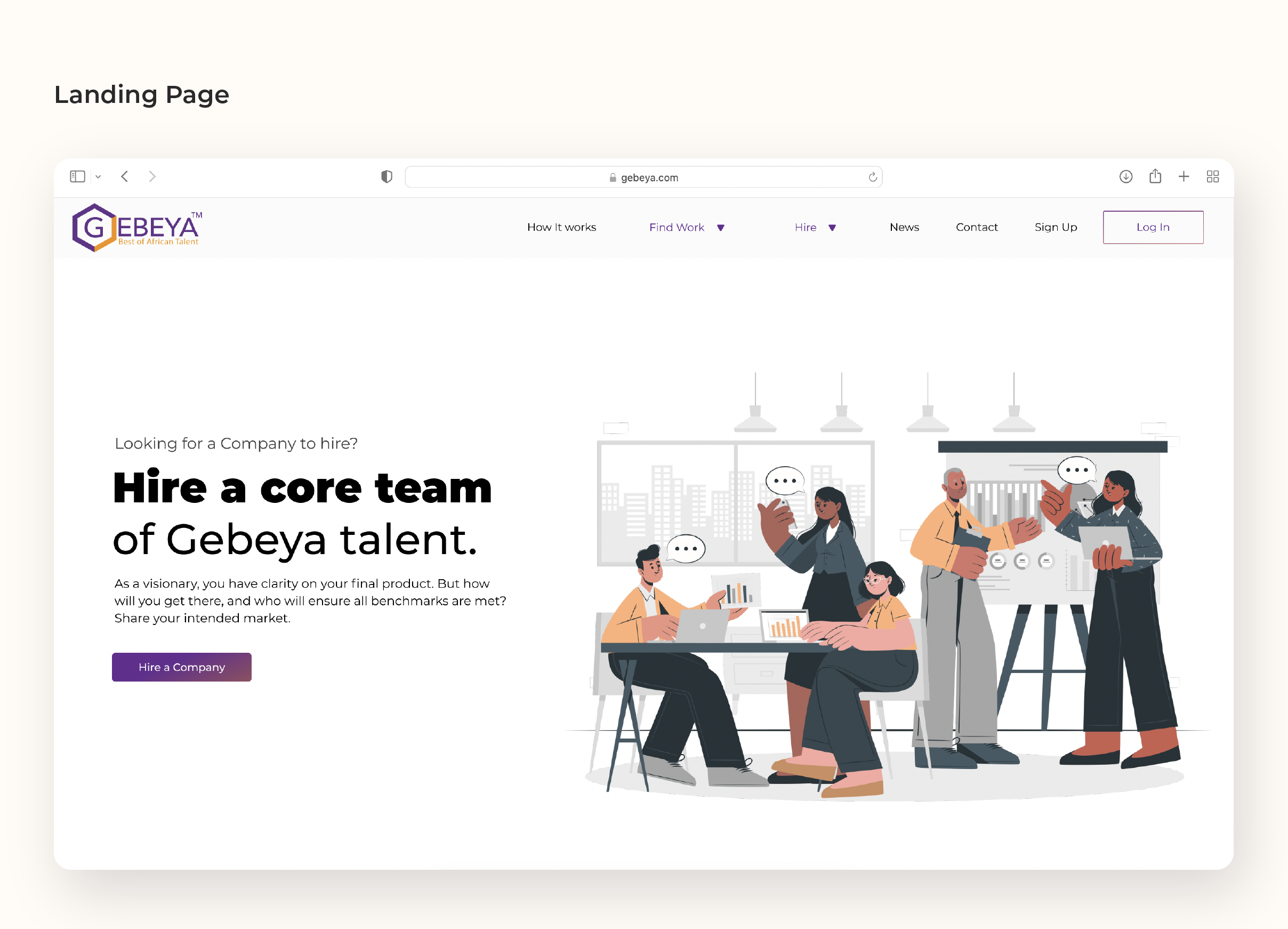
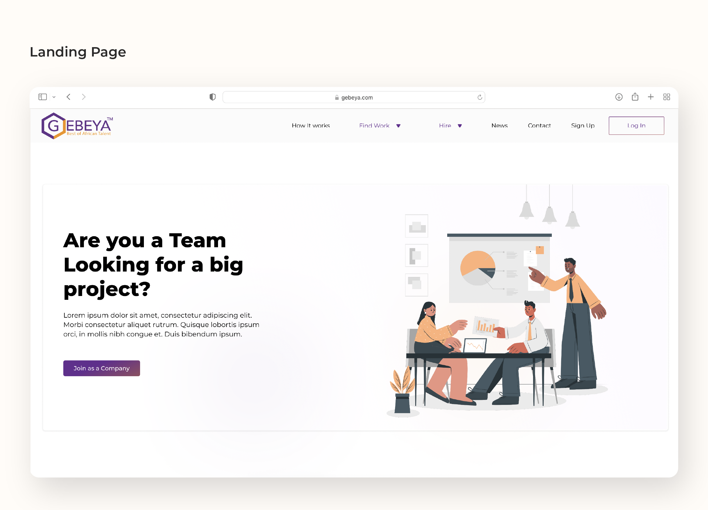
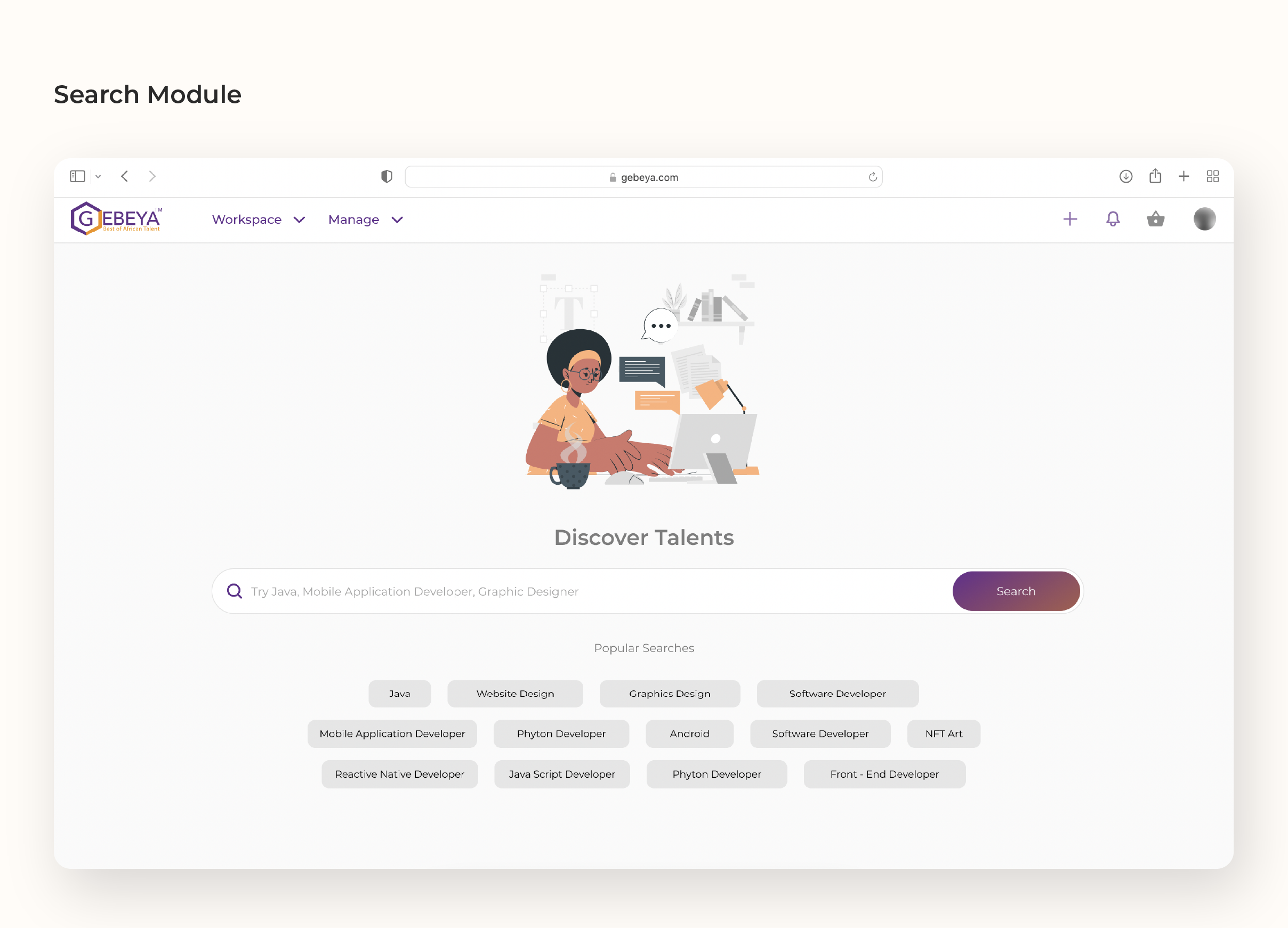
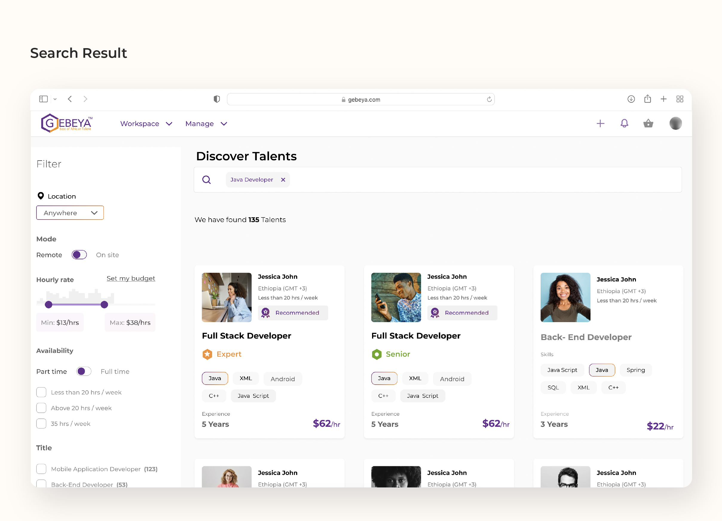
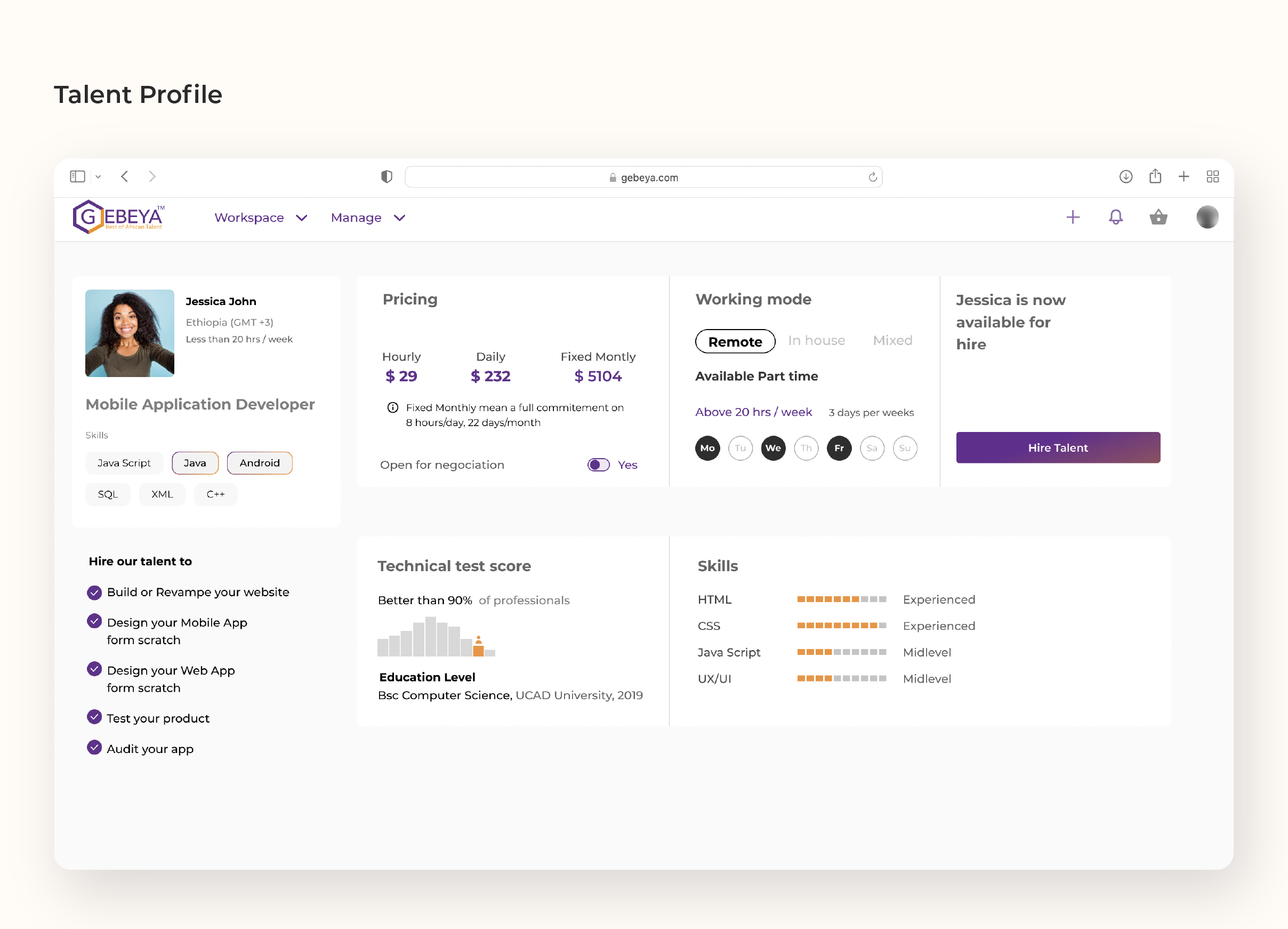
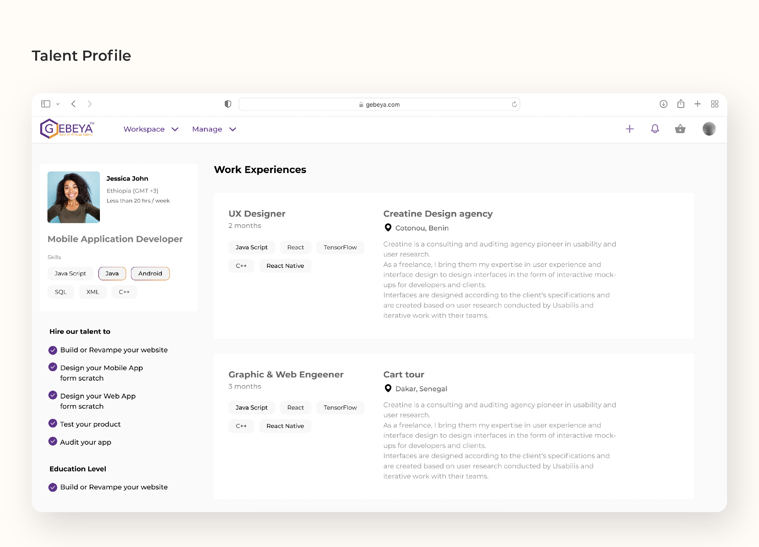
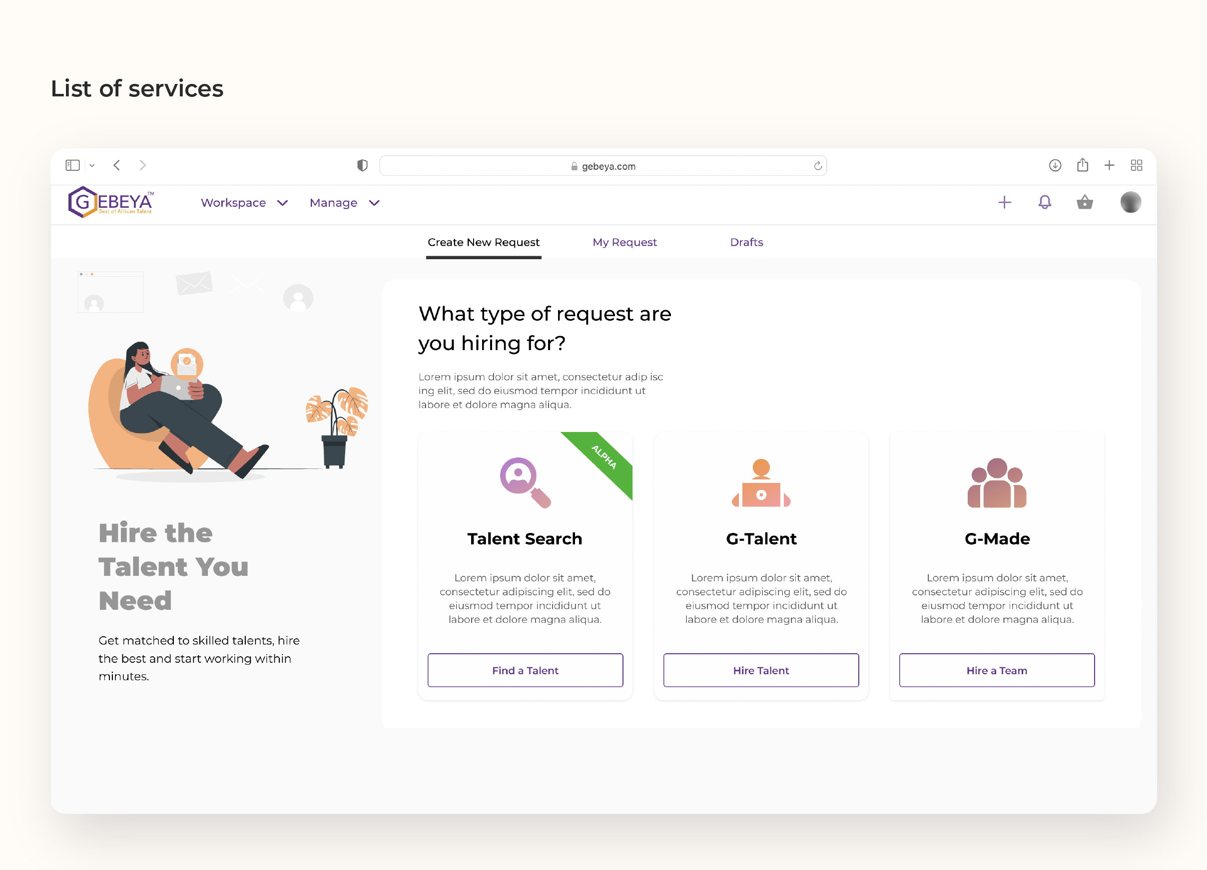
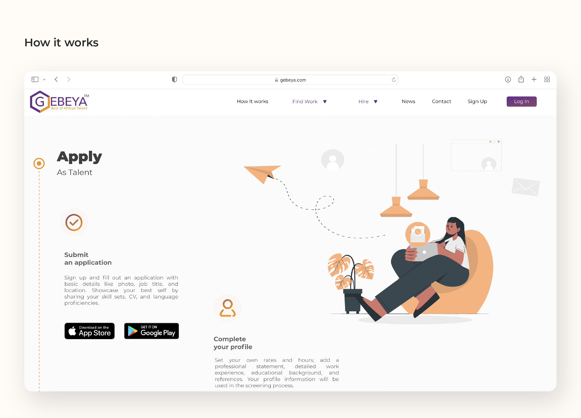
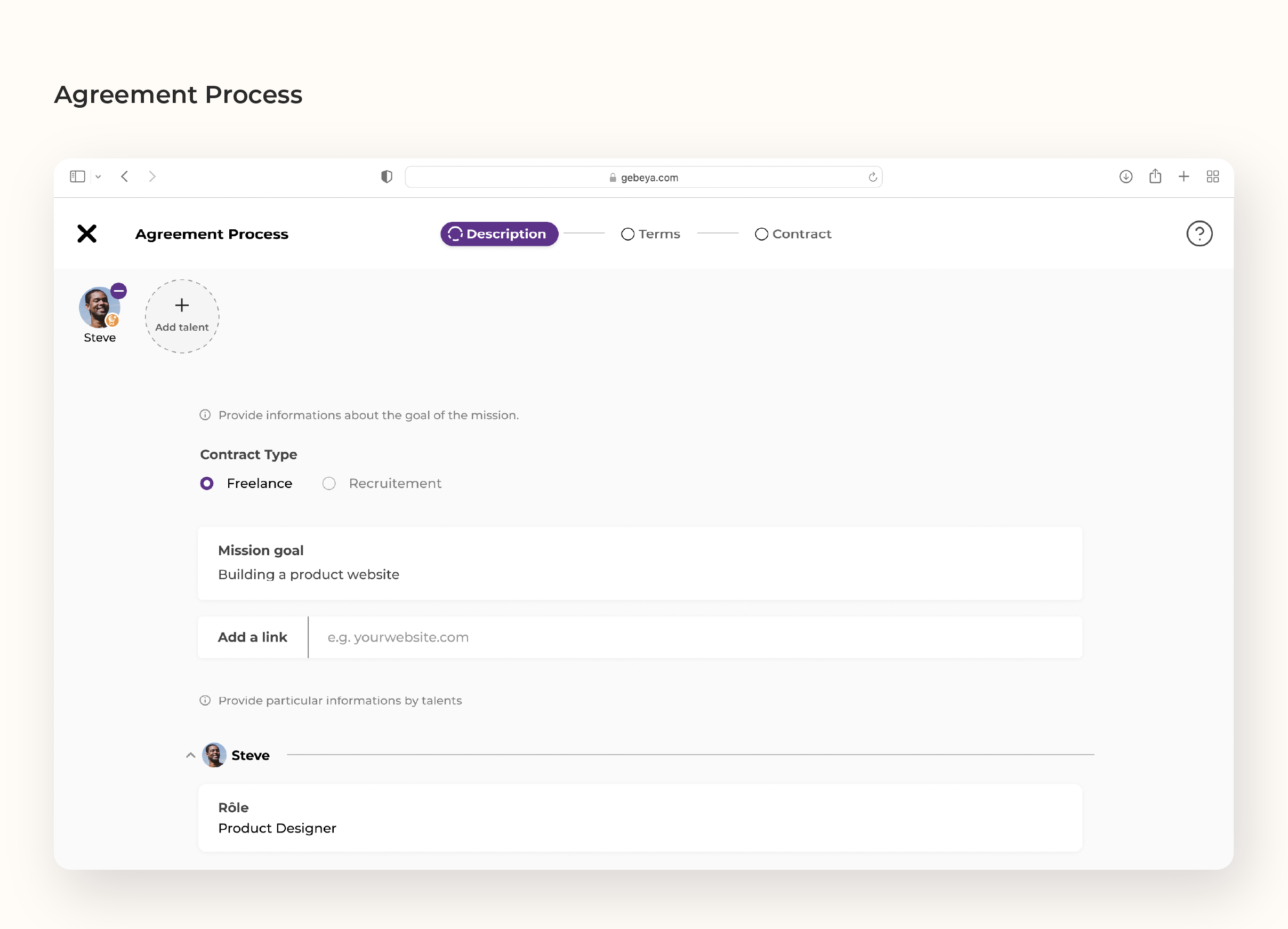
This case study is about optimizing Gebeya's web app for better user engagement, sign-ups, and to help Gebeya reach the intended business goals using Ux/Ui design interventions. Currently, the platform uses forms that the client fills out to find and hire talent. The platform also allows freelancers to find work by connecting them with clients looking for talent. To increase user engagement, sign-ups, and ultimately increase matches between clients and talent, the platform requires further refining.
My Contributions
Sole Product Designer
The Problem
Clients take a long and complicated path to know who they are hiring and for how much. Sign in / sign up page, break the user flow and hides the most important pages far away. Information needed by a user to figure out the two main products is not expressed well. Categories and subcategories pages create unnecessary detours to come back to the same Log In/ Sign up page. Categories page doesn't have a clear CTA and visibility towards user goals. Testimonials are far down the landing page and are not visible early on in users' journey.
User Research
The product team noticed that most users are checking few pages and not going to the right funnels and goals that might lead to more sign ups. Most users wonder around the landing page and drop-off after few interactions. To understand the problem further, in-depth user research calls were set up with our biggest clients' and talents.
Research Findings
User Flow
Basing the initial stage of the design on the results found on theuser research, I gave priority to simplifying the journey clients take from the landing page to making their first hire. In addition leaving the old way of filling out forms to hire a talent, the we emplemented a talent search and hire process.